Services
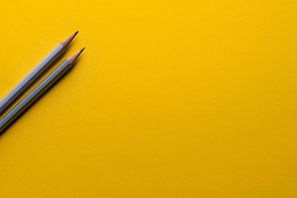
Pantone Color Trends for 2021

The graphic arts and photography segment is directly affected by fashion and trends – and when we talk about colors – namely Pantone Colors -, the influence is even greater.
After all, we have completely different results with a good application of colors or their strategic absence.
For the photography sector in particular, it is not just about colors in environments and clothes for a photo shoot; the albums bring a harmonious combination of colors and following the trends they can highlight even more a job already well conducted.
Thinking about it, we will bring in today’s publication the trends for Pantone Colors for 2021! But, why Pantone? Why should I follow the tips of this company?
In fact, many people do not understand the relevance of Pantone to the artistic market and all the areas impacted by it, but we are going to change that today!
But, what is the importance of Pantone Colors for the market?
Pantone is the largest color company in the world and it all started when its founder, Lawrence Herbert, developed the first color system in the early 1960s, shortly after working for a few years to manufacture color cards for cosmetic companies .
From then on, the cards with variations in the color tone and their respective codes came out, which ended up guiding the entire market and, thanks to that, remain relevant today.
The Pantone Color Institute was developed more than two decades ago, and is the Pantone business unit that highlights the main colors on a seasonal basis, bringing together seasons, specific moments experienced by us as a society and the trends of pop culture as a whole.
One of the main initiatives of the Pantone Color Institute is the Color of the Year, which determines the color of that year following various fashion trends and, mainly, discoveries and applications of new colors within key areas such as design, cinema, fashion, collections of art, among others.
Oh, and speaking of the color of the year, do you know which one was chosen in 2021? Well, it was not about one, but about the combination of two specific colors:
PANTONE 17-5104 Ultimate Gray + PANTONE 13-0647 Illuminating!
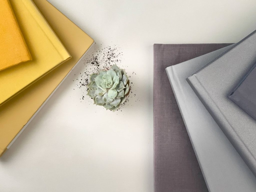
Combining functionality and solidity and bringing its contrast to the warmth of the warm color, the combination comes with the proposal of adding positivity to our lives!
The messages and the impact of the colors of the year
As if it were a transition, granting us the hope that the future will be very well lit, PANTONE 17-5104 Ultimate Gray + PANTONE 13-0647 Illuminating brings a message of happiness supported by strength.
Imagine using the Pantone color combination of the year 2021 in a photo session, or even in the composition of an album whose wedding had these prominent colors?
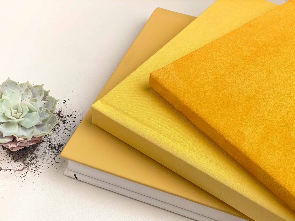
For Illuminating yellow, we have three options available to suit any individual preference, due to the difference in textures.
The leather, especially the yellow color, is possible in Personalized Albums and Acrylic Albums, which reflect the identity and uniqueness of a photograph.
In more exclusive collections, Matted Album and Cromalux also allow the use of the leather.
When the taste is related to the rustic tendency of the linens, we recommend the Linen Collection, where the Yellow Canvas is found, with a rough touch typical of the linen and the option of UV Printing as a finishing touch.
Although the leather and lines have their prominence, velvety textures are the winners in professional albums and are the material of choice for photographers and clients.
The application of Pantone 2021 Colors in digital albums
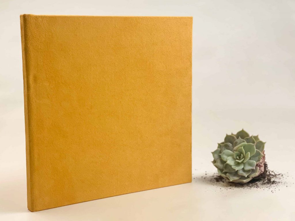
In the Q4 Vintage Collection, where all the velvety colors are found, the Ecosued range has a contrasting yellow color, the perfect combination with the PANTONE 13-0647 Illuminating.
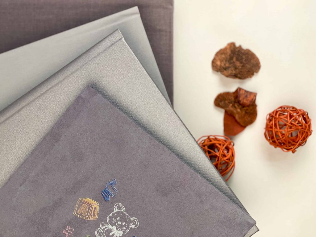
Like Illuminating, Ultimate Gray can also be found in all collections, in different textures.
The Classic, Personalized and Acrylic Collection integrate the Madras, Faia and Frederica polipeles, which stand out for their different consistencies: more or less textured, more or less shiny.
The Linen Collection also offers more than a gray option: the gray metallic canvas or gray canvas, different not only to the touch, but also to the eye. While the gray canvas is lighter and only allows UV printing in a darker tone – to look good – the gray metallic canvas surpasses its versatility in printing color monograms and possible use of varnish.
But, once again, it is the Ecosued range, in the Q4 Vintage Collection, that conquers. The gray color, with velvety texture, wins by the minimalist aspect and stands out for the UV printing options.
Do you feel inspired yet? Stay with us for more tips and trends!